
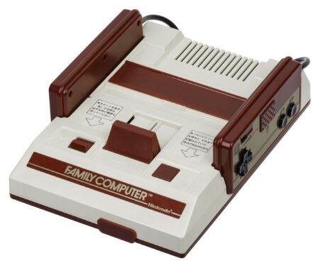

On the Famicom (Family Computer) controller, B was on the left for “Back” and A was on the right for “Advance”. Secondary and Primary, Brake and Accelerate, etc., respectively.
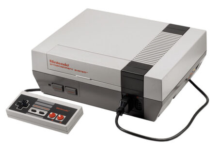
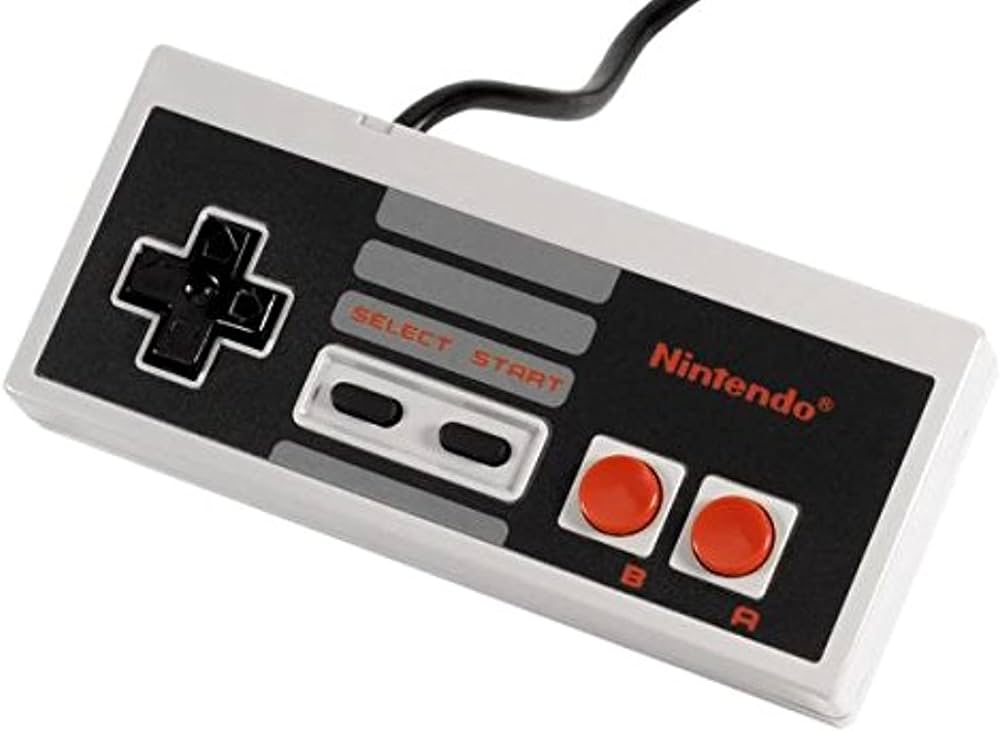
The same was true for Famicom’s counterpart, the Nintendo Entertainment System.
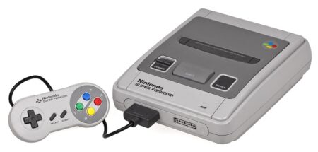
This continued with the Super Famicom / Super Nintendo Entertainment System, but with more buttons added.
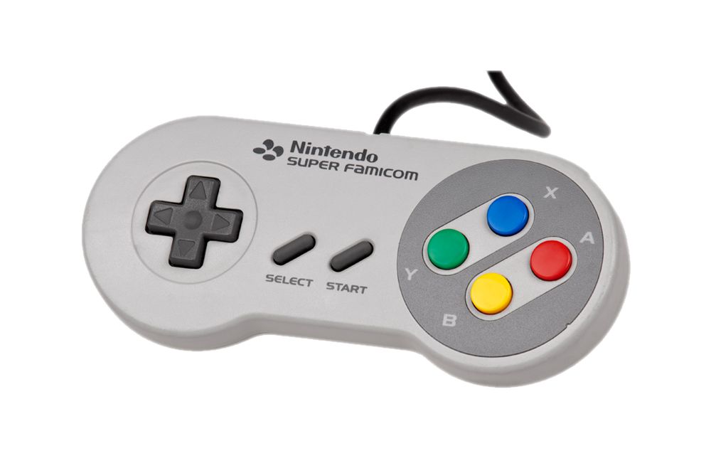
For starters, in Japan, the Tategaki style of writing goes from Top Right to Bottom Left, which is why you have both primary buttons in their positions, X and A, with their partners being down and to the left, in Y and B.
As for why were X and Y chosen, they are two letters most commonly used in math, with X being the lead.
B and A were on the bottom to replicate what NES did before it, with X and Y above (respectively) to show growth and ascension, via another layer being added onto Nintendo’s controller. L and R buttons were also new, standing for Left and Right.
Another point of interest was that beginning in East with A, if you traveled clockwise, you would hit B second, followed by Y which has three points, third, and X which has four points, fourth. The coloring for this fit with how Japan was in the East, being the land of the rising sun, Yellow was for the earth beneath, green was for the horizon, and blue, for the sky.
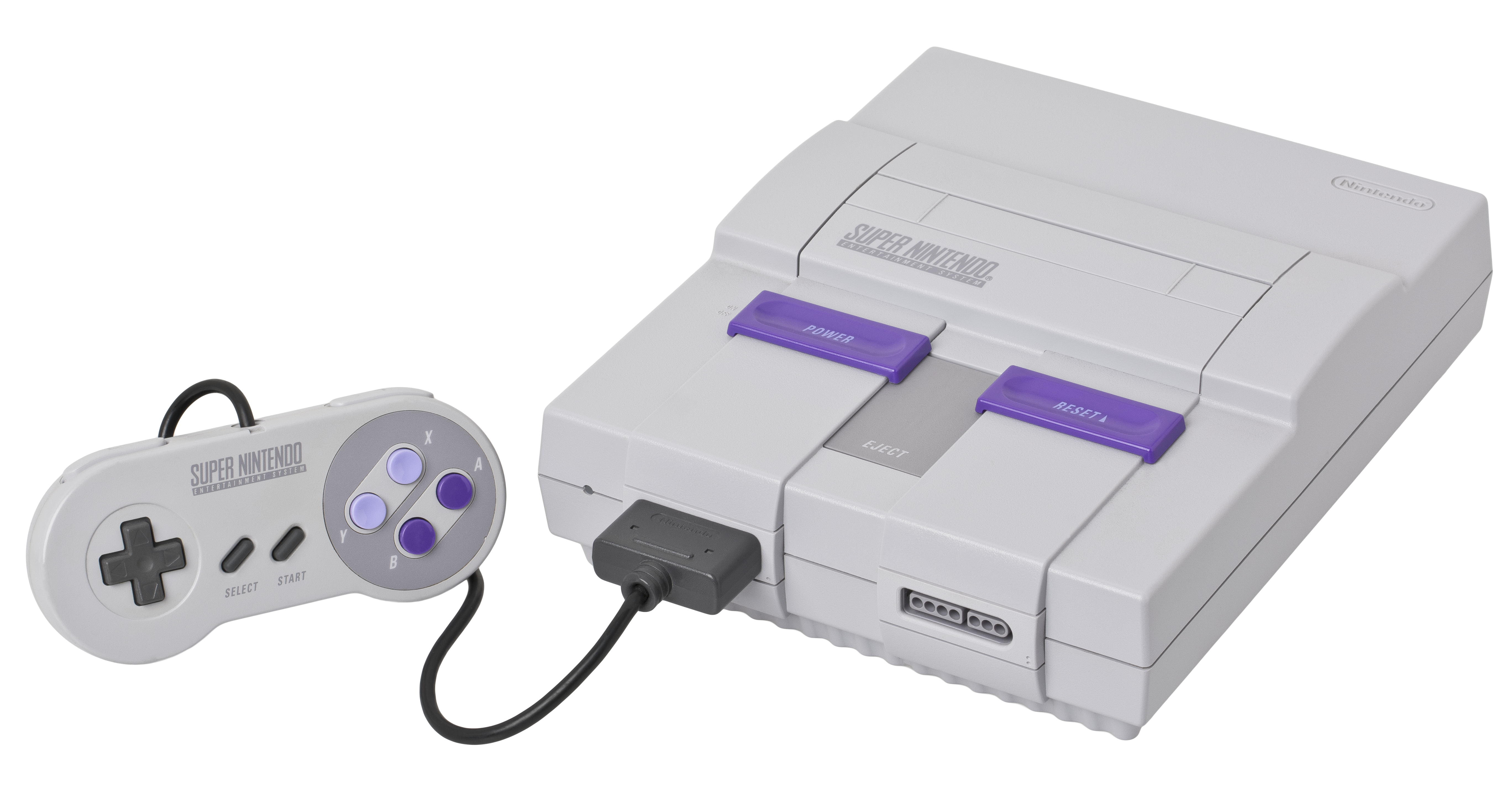
In regards to the North American look of the SNES, Lance Barr (who worked at NoA from 1982 to 2021) and was in charge of designing multiple Nintendo products, believed in “design semantics”.
This is the concept in which the visuals of a device should give a clue as to what the unit is capable of. From youth, we are taught that hard, angular objects are strong and dangerous. The Super Famicom was thought to be too soft for the North American market, especially after the NES succeeded with its angular design, fitting well into homes around the world,
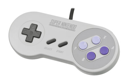
The SNES was a powerful system, with gray (seen in all versions) being the primary color which resembled intellect and purple which historically was associated with royalty (chosen only for the North American model). With purple being added to the system, it made sense for the controller to get the same treatment, for the red, yellow, green, and blue setup was thought to look too much like a kids’ toy for western audiences.
Lance’s approach with the SNES was to convey power with its angles, but to be more sleek and modern than the NES, so people would identify the platform with strength, and for its controller to be rounded, which psychologically is welcoming, safe, and promotes touching. Also, two concave and two convex buttons were chosen to specifically make it easier to differentiate what you were pressing, without looking down. (This was different that the Super Famicom and European versions which had four flat/convex buttons.)
Another reason for US’ change, was that one of the primary reasons for NES units to be turned in for repairs, was water damage, due to people placing cups and bowls on top, which led to spillage. The North American Super Nintendo has the least amount of single level surface area, despite being bigger overall than its counterparts. Finally, like NES, the Super Nintendo Entertainment System also had a flat bottom to allow future access should an add-on be necessary…such as the ill-fated collaboration with Sony. (Lance personally didn’t think the Super Famicom looked the best, when placed on top of other objects of similar composition, giving more reason to modify the platform’s look.)
And there you have it! I hope you enjoyed this look back on the SNES and now know why there are different versions out there…and that’s not including future remodels!